
You’ll find soft spring palettes that calm and lift a home without feeling fussy. Think airy lavender bedrooms, baby‑blue nooks that visually widen small rooms, and mint entryways layered with linen textures. I’ll show how to balance pastels with warm neutrals, where to add contrast, and which finishes keep things peaceful — plus simple swaps that refresh a room in minutes.
Lavender Calm for Serene Bedrooms
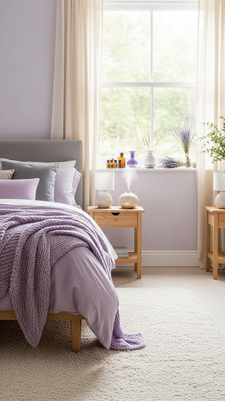
When you paint a bedroom in soft lavender, you instantly invite calm without losing sophistication; the hue balances cool and warm undertones so it pairs beautifully with creams, muted grays, and natural wood.
You’ll layer soft violet textures and minimalist furniture to keep movement light.
Add lavender aromatherapy near a window, and you’ll create an airy retreat that feels both liberated and composed.
Baby Blue to Open Small Spaces
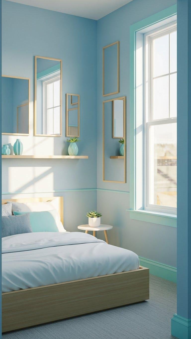
A bowl of sky-blue paint can make a cramped room feel airy and expanded—baby blue reflects light and visually pushes walls back, so you’ll get more perceived space without changing the layout. Embrace soft aqua accents, pale cyan trim, and minimalist composition to amplify openness.
You’ll arrange mirrors, slim furniture, and clear sightlines, creating a liberated, airy interior that feels both calm and spacious.
Blush Pink for Soft Textiles
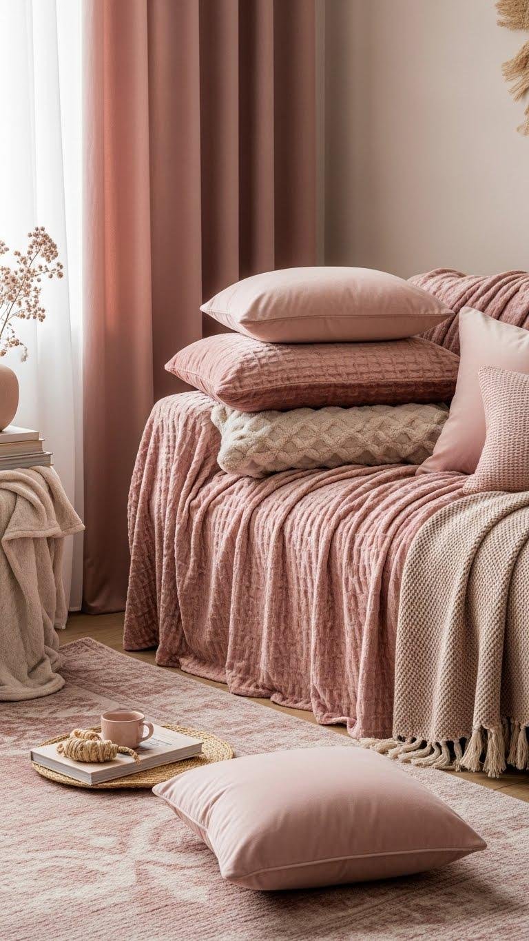
If baby blue opens the room, blush pink brings it in close with a softer, tactile appeal.
You’ll layer velvet blush throws and cushions to anchor seating, mixing textures for depth without clutter.
Choose rosy neutrals for rugs and drapery to keep balance and light.
Let tactile tones invite you to linger, curate calm corners, and shape a liberated, intimate composition.
Buttery Yellow Accent Walls
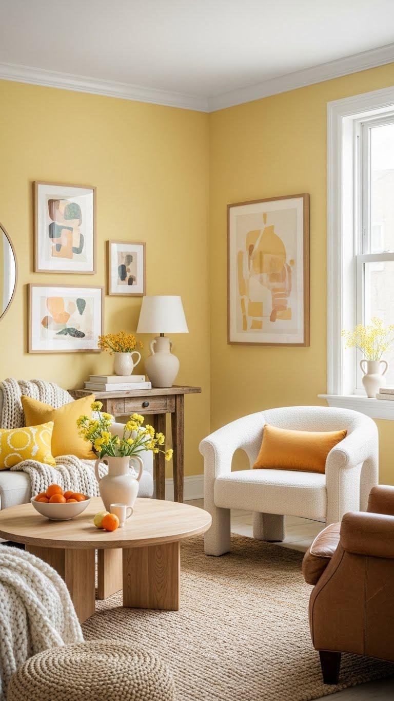
Often you’ll find that a buttery yellow accent wall quietly lifts a room’s mood without stealing the scene, creating a sunlit foil for sculptural furniture and muted palettes. You’ll use soft citrus tones with cream accents to frame art and seating, invoking vintage sunlight without kitsch. Choose a matte sheen for subtle depth, balance with tactile neutrals, and keep compositions airy and liberated.
Mint Green for Fresh Corners
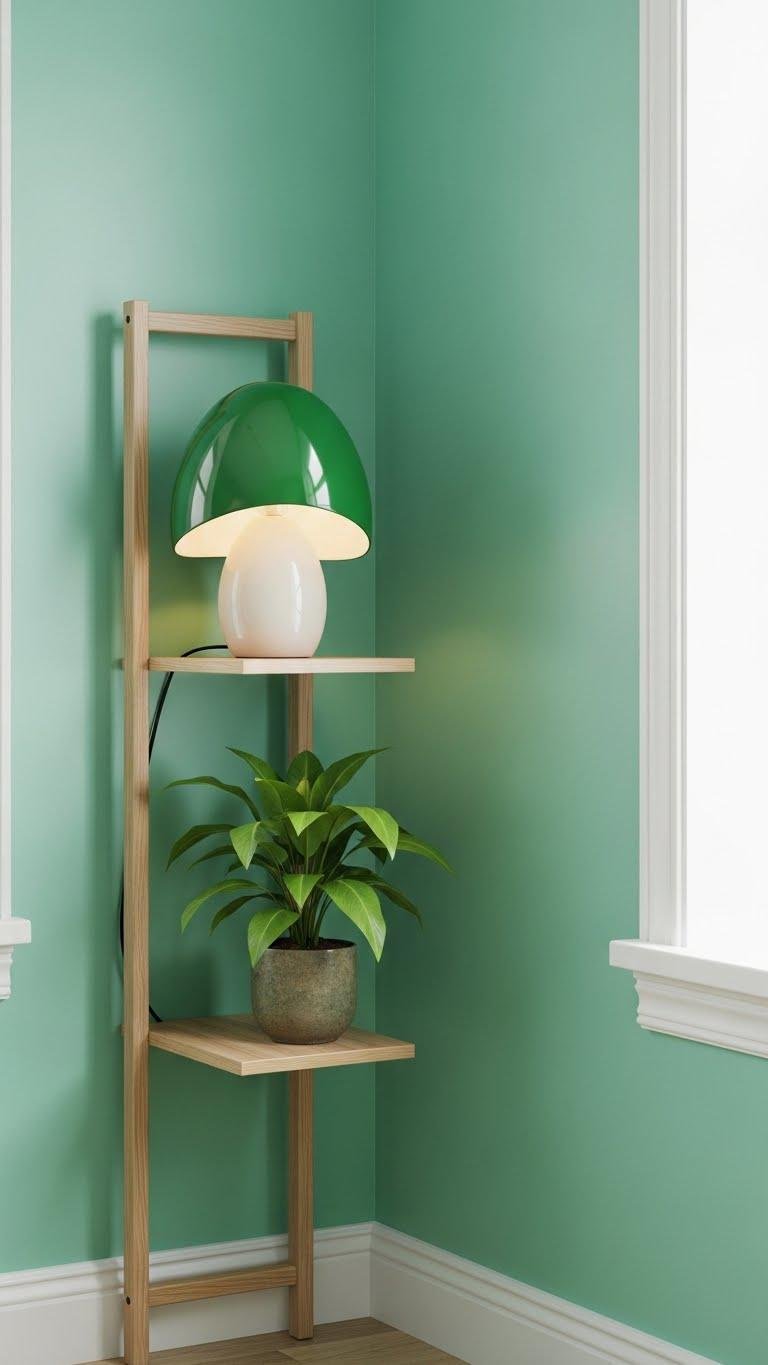
You’ll find mint green instantly refreshes corners, giving them a cool, clean lift without demanding attention. Use it to carve a minty nook that breathes — pair with white trim and natural wood for lightness.
Frame a green vignette with slim shelving, a sculptural lamp, and a single plant. You’ll create small freedom-filled pockets that feel calm, crisp, purposeful.
Sage Green Living Room Base
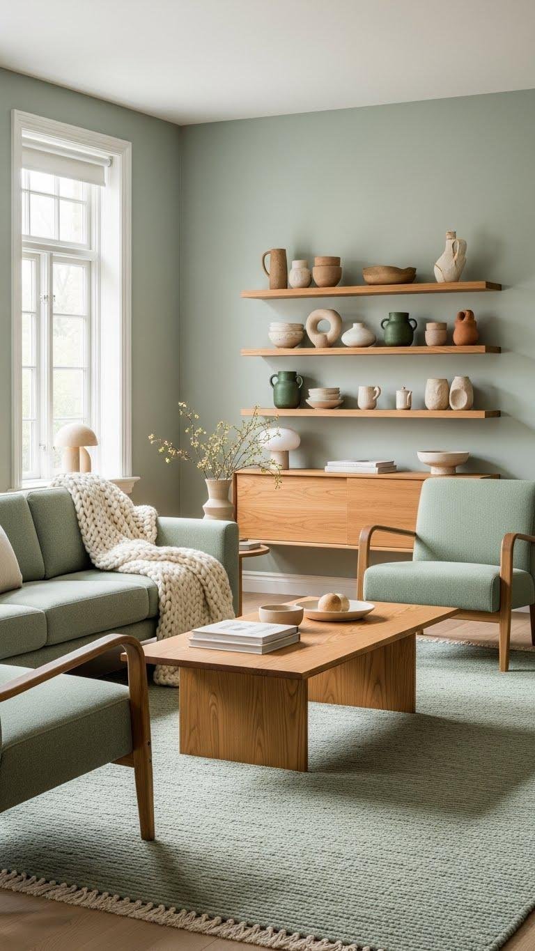
When you anchor a living room in sage green, the space feels grounded yet softly contemporary—its muted, gray-tinged warmth gives furniture and textiles room to breathe. You’ll layer sustainable textiles for tactile calm, pair clean-lined seating with warm wood, and punctuate shelves with artisanal ceramics for personality. Embrace light, negative space, and freedom to edit — restraint becomes peaceful, intentional living.
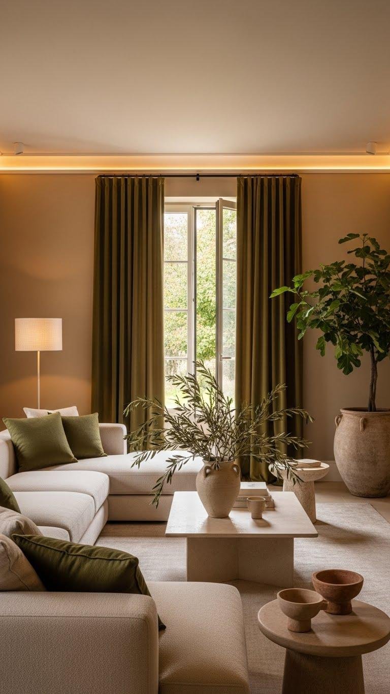
Olive Matcha for Grounded Depth
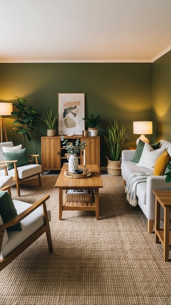
Balance is what olive matcha brings — a rich, earthy green with a warm undertone that roots a room without weighing it down.
You’ll use olive depth to anchor seating and shelving, then let lighter neutrals and natural textures float.
Matcha grounding encourages layered contrasts: matte walls, warm wood, focused accents.
The result feels spacious, intentional, and freely lived in.
Terracotta Cozy Accents
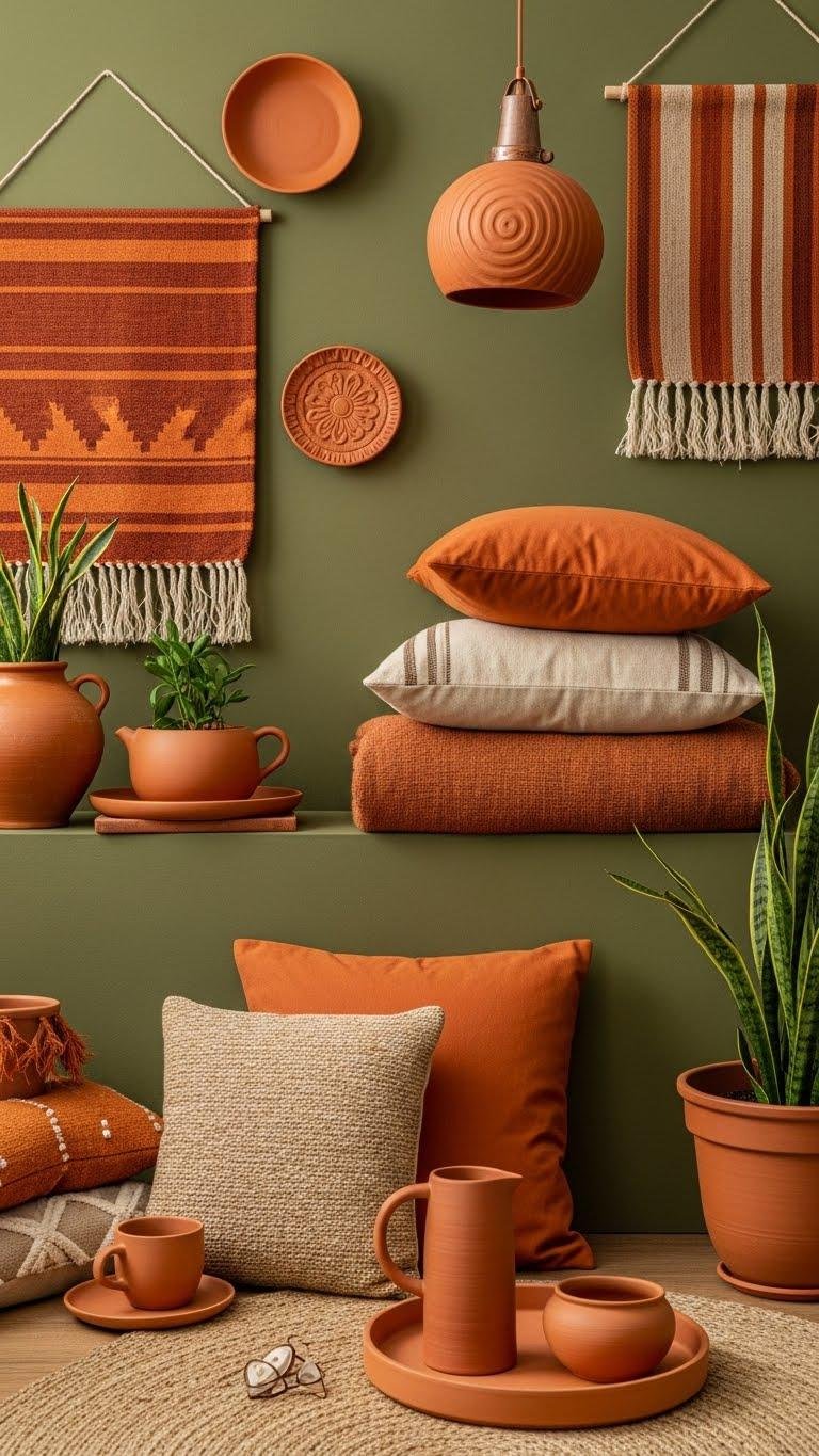
Introduce terracotta as a warm punctuation that livens olive matcha’s cool earthiness — it’s the accent that makes a room feel intentionally cozy.
You’ll layer sun baked ceramics and rustic clay textiles to cut monotony, guide sightlines, and anchor seating.
Choose small bursts—pillows, planters, a tray—so the orange-brown spark feels intentional, free, and compositionally bold without overpowering calm.
Camel and Toffee Cream Foundations
Because camel and toffee cream form a neutral backbone, you can let olive matcha and terracotta sing without the space feeling busy. Use camel walls and toffee cream upholstery to anchor layers; add velvet drapery for tactile depth and ambient lighting to soften edges.
You’ll compose rooms that feel open and liberated, where accents breathe and movement guides the eye with calm confidence.
Warm Beige Honeyed Sand Backdrops
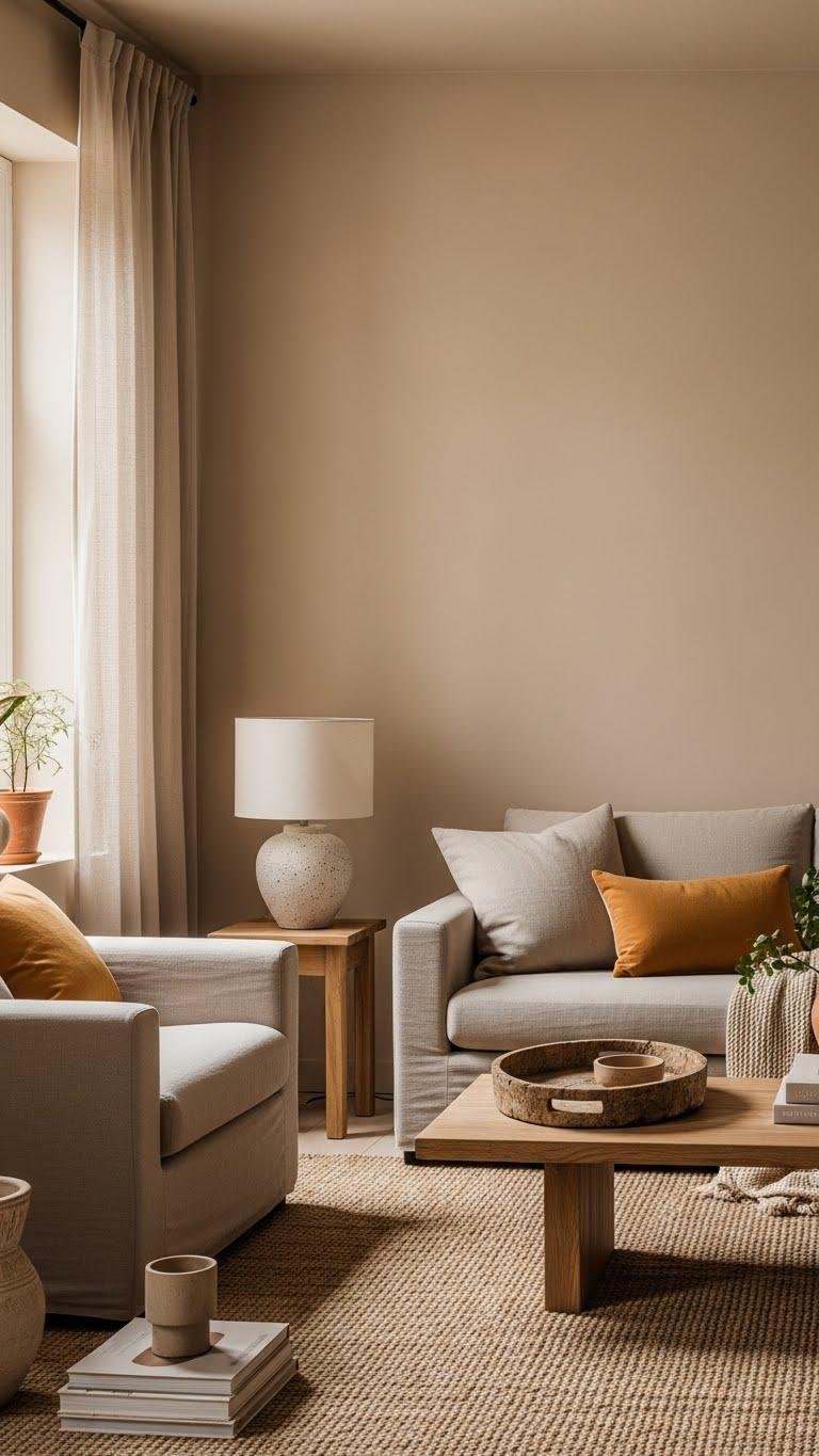
Move from the camel and toffee cream foundation into warm beige honeyed sand backdrops to broaden your neutral palette while keeping the room luminous. You’ll layer soft ochre accents and sandy taupe furnishings to create depth without weight. Choose matte finishes, natural textures, and restrained contrast so surfaces breathe; you’ll enjoy a liberated, calm composition that feels airy and intentionally curated.
Warm Lavender Mid-Tone Walls
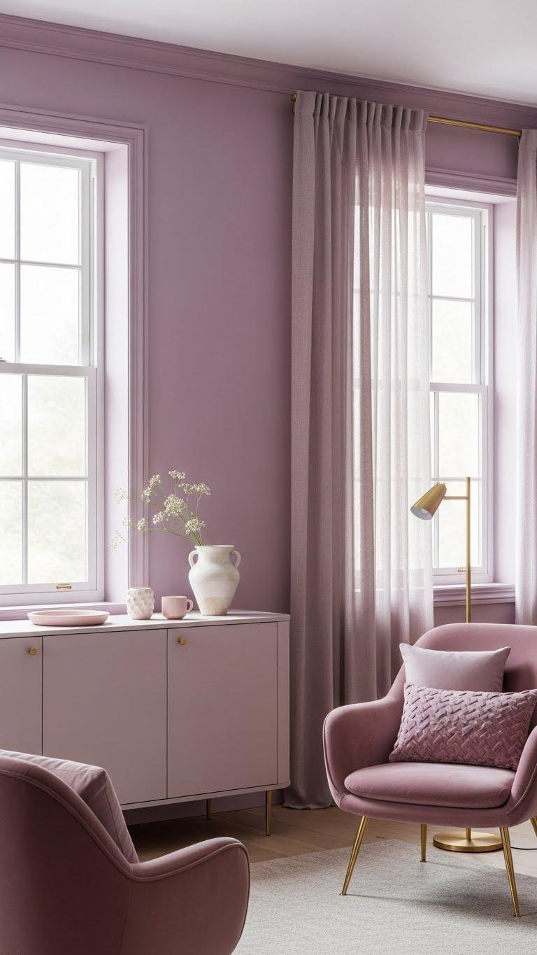
When you swap honeyed sand for warm lavender mid-tones, the room gains a soft, sophisticated lift that reads modern without feeling cool or distant.
You’ll layer vintage mauve accents and sunlit lilac highlights to create depth, balancing furniture silhouettes and natural light. Choose matte finishes, brass hardware, and uncluttered compositions so the palette breathes and you move freely through calm, intentional spaces.
Earthy Coral for Subtle Energy
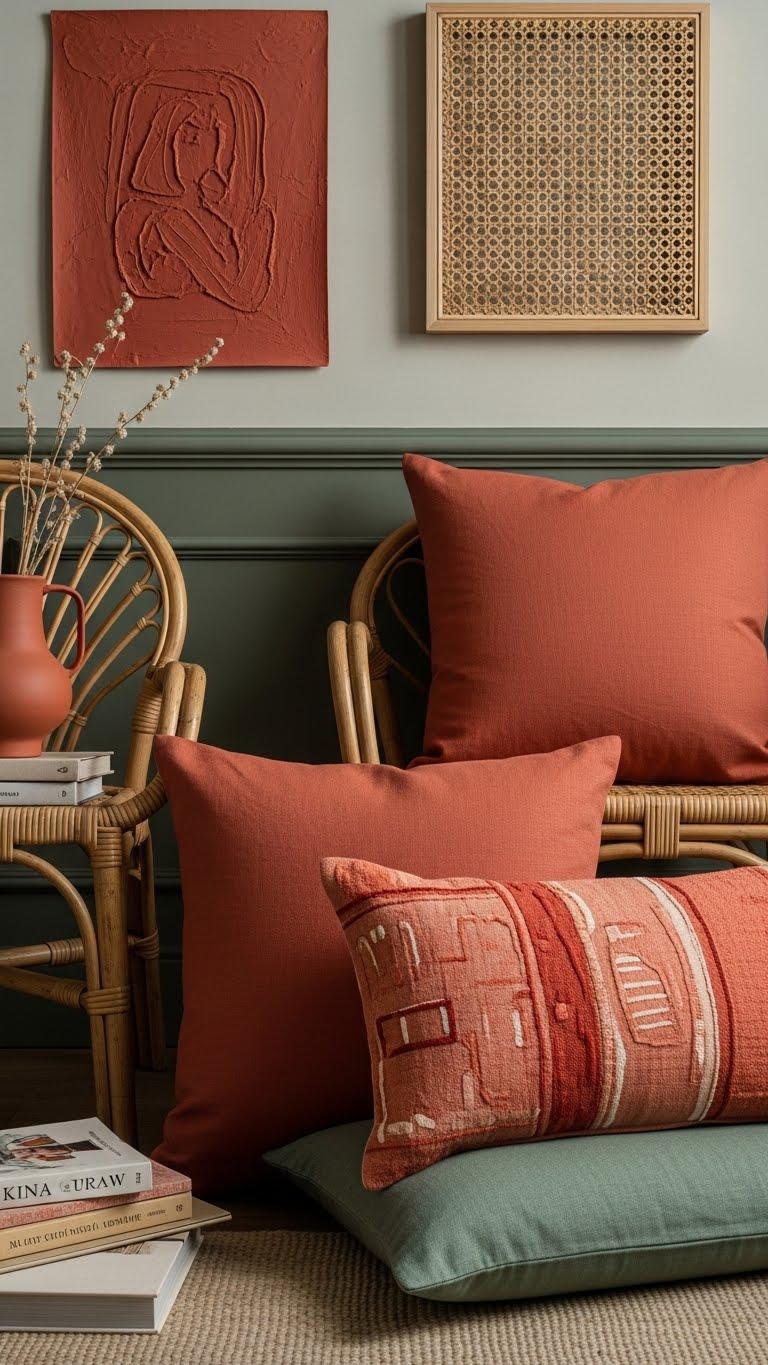
Lean into earthy coral to add quiet warmth that energizes without shouting; its clay-tinged orange softens vividness and ties easily to natural textures. You’ll balance handmade coral accents with linen, rattan, and muted greens, using earthy pigments to ground compositions.
Place color in layered vignettes—pillows, art, a single painted trim—so rooms feel liberated, intentional, and calmly alive.
Marigold Pops in Accessories
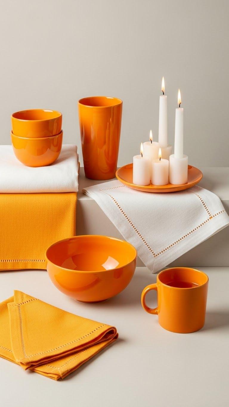
Brighten your vignettes with marigold pops in accessories that snap a room into focus without overpowering it. You’ll layer marigold ceramics, lightweight throws and marigold napery to punctuate neutral planes and natural textures.
Place one bold bowl, a stitched napkin set, or a single candle cluster to guide sightlines. Keep compositions spare so color reads as confident, joyful, and free.
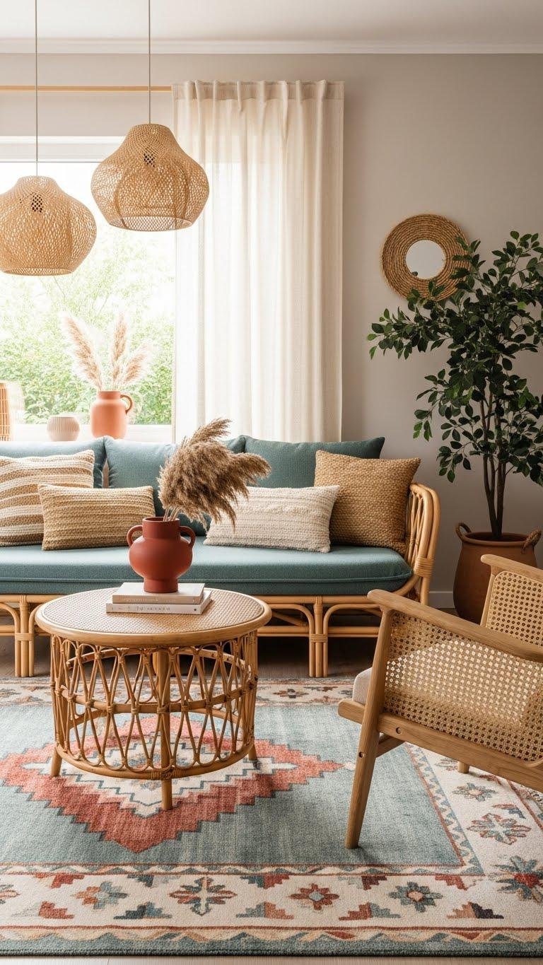
Dusty Teal Retreat Palette
A dusty teal retreat calms and centers a room, so you can layer muted blues with warm neutrals to create a composed, spa-like vibe. You’ll pair soft teal walls with linen drapery and tactile rugs, introducing velvety texture in cushions and throws.
Accent with vintage brass fixtures for warmth, keep compositions airy, and let negative space grant you freedom and calm.
Muted Terracotta-Red Focal Pieces
If your dusty teal retreat needs a warm anchor, introduce muted terracotta-reds as focused accents that ground the palette without shouting. You’ll pick handmade clay vases with matte glaze, low-sheen cushions echoing muted sunset hues, and sculptural bowls showing layered terracotta textures. Place pieces deliberately to chart sightlines, balance cool tones, and keep airy freedom in composition.
Brass and Warm Nickel Details
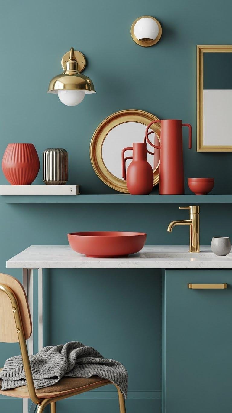
Contrast sharpens: introduce brass and warm nickel details to thread warmth through your dusty teal scheme without overpowering the muted terracotta-red focal pieces.
You’ll choose polished hardware and finishes with a soft patina to catch light, creating subtle warmth. Embrace mixed metals sparingly—pairing warm nickel accents with brass fixtures lets you compose liberated, layered vignettes that feel deliberate and effortless.
Rattan and Light Wood Pairings
Lean into rattan and light woods to soften the dusty teal and terracotta-red mix—these pale, textured materials bring breathable warmth and a natural counterpoint that keeps the palette airy. You’ll pair woven textures and pale finishes with curved silhouettes and slim profiles, creating relaxed, sculptural layers. Choose simple compositions that let color sing while materials feel open, honest, and free.
High-Contrast Trim for Polish
Often a crisp trim line is what turns a pretty room into a polished one: pair deep, saturated trim—think inky charcoal or navy—with softer wall hues like dusty teal or warm clay to sharpen edges and define architectural details.
You’ll use polished contrast and precise trim detailing to free the composition; high gloss borders give intentional edge definition, making rooms feel composed yet liberated.
Accent Textiles for Seasonal Swaps
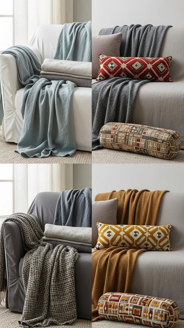
Swap textiles seasonally to refresh a room’s mood without repainting: layer light, breathable linens and muted cottons in spring, then bring in textured wools, velvets, and richer weaves as temperatures drop. You’ll choose a restrained palette, mix layered throws for depth, and use patterned lumbar pillows as focal accents. Keep scale balanced, contrast subtle, and compositions airy so you can rearrange freely.
Sky Blue Bathrooms and Tiles
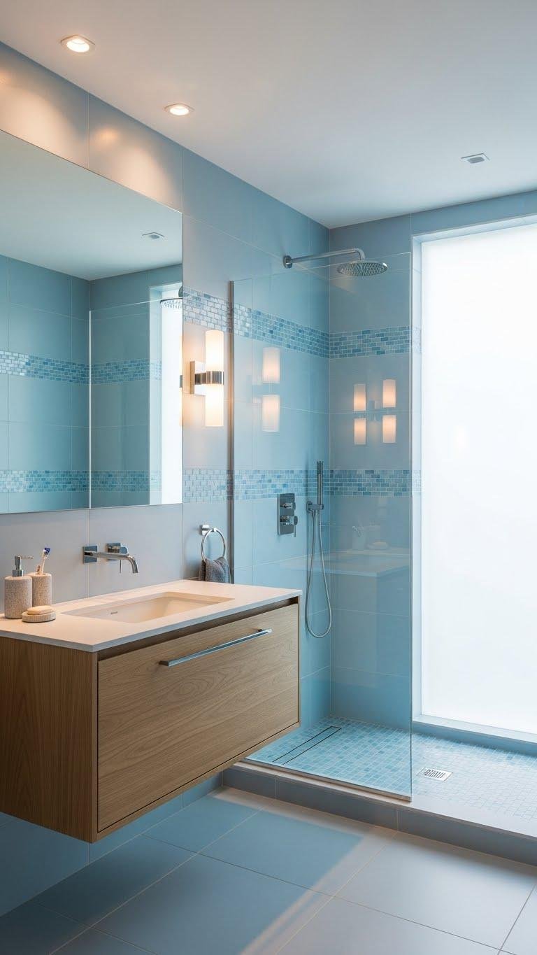
A sky-blue bathroom feels like a small personal retreat, where cool, airy tiles set the tone and guide your eye through the space. You’ll layer cerulean mosaics for texture, balancing matte porcelain and glass to keep surfaces calm.
Think coastal spa restraint: open sightlines, minimal hardware, and a single warm wood accent to free the room and your routine.
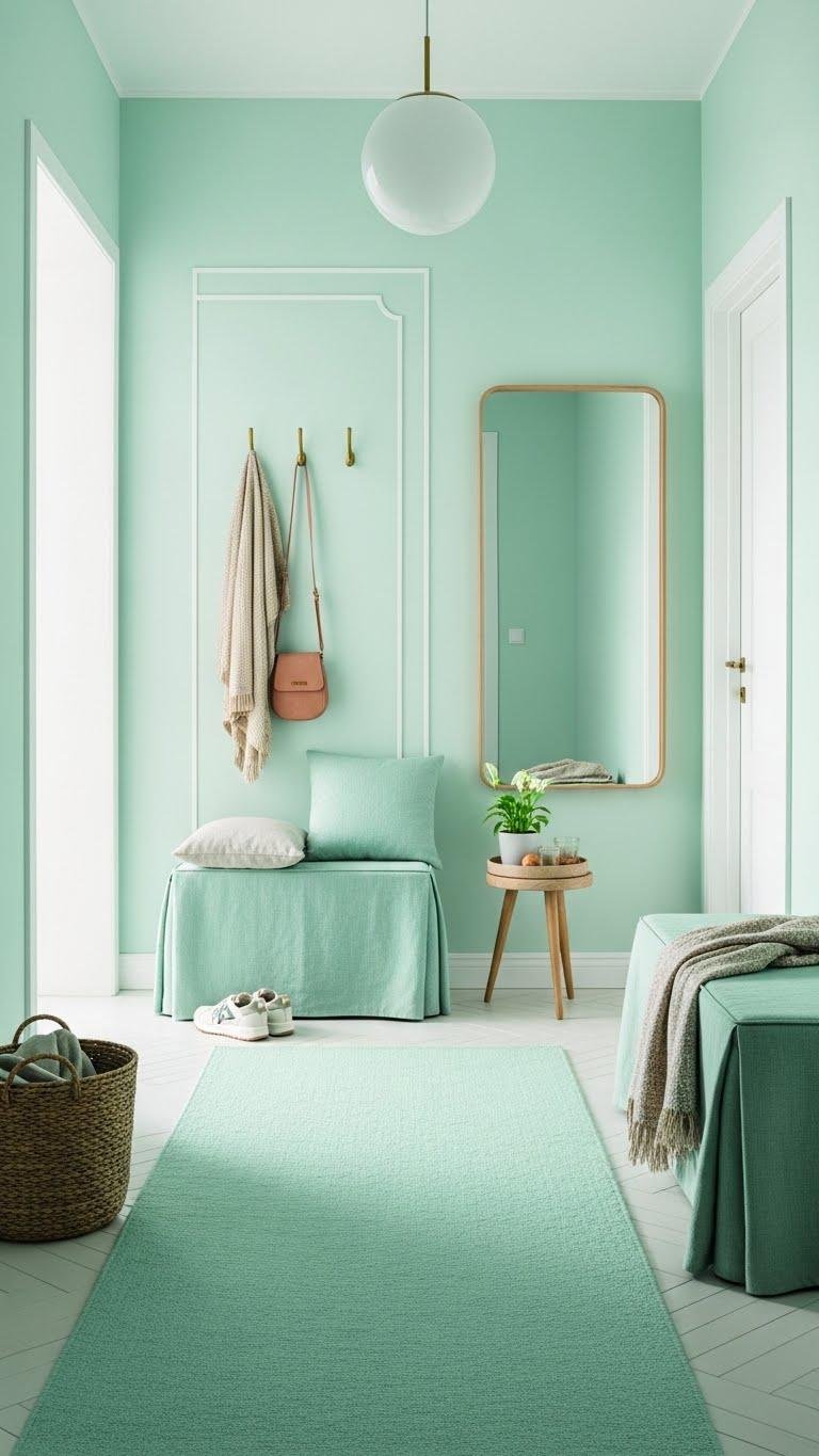
Mint and Linen Entryway Layers
Layering mint and linen in your entryway creates a fresh, grounded welcome that reads modern and composed. You’ll pair soft mint paint or a runner with woven linen textures—rugs, cushions, a draped bench cover—for tactile contrast. Keep lines simple, add a matte brass hook or mirror, and let airy light emphasize composition. It feels freeing, calm, and effortlessly curated.